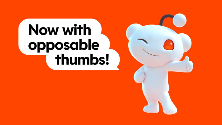
Reddit, the popular social media platform, has recently introduced a significant brand refresh, transforming its classic orange logo and giving its iconic “Snoo” character a stylized, three-dimensional update. This rebranding effort includes bespoke typefaces – Reddit Display and Reddit Sans – designed to embody the spirit of online conversations. Reddit Display features conversation bubble motifs, while Reddit Sans offers clear, legible letterforms for an enhanced user experience.
In addition to the logo and typography changes, Reddit’s color palette has expanded beyond its traditional OrangeRed to include vibrant hues like GuavaPink, LimeGreen, BananaYellow, and JuniperBlue, reflecting the diversity and vibrancy of its communities and conversations.
This brand overhaul is part of Reddit’s broader strategy to enhance its platform’s appeal and distance itself from its past reputation. Initiatives have included removing controversial subreddits, introducing new ad targeting tools, and revising API access and subreddit moderator controls. However, these changes come with a trade-off, as evidenced by the shift from reporting 430 million monthly active users in 2019 to 70 million daily actives, suggesting a possible decline in monthly users.
As Reddit moves towards a potential IPO, this rebranding marks a crucial step in aligning its business strategy with a more structured and brand-safe approach. The effectiveness of these changes and their impact on Reddit’s user base and business prospects are poised to become clearer in the pivotal year of 2024.

